
Exchange Gallery: June Featured Artists
June 3 - 24, 2016
Exchange Gallery
Featured Artists: Sarah Blackmon Lips // Diala Estela // John Orrand // Lakeshia Reid // Tim Saguinsin

June Featured Artists
June 3rd- 24th, 2016
Opening Reception: June 3rd, 6-10pm
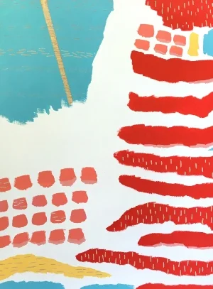
Sarah Blackmon Lips
I spend a lot of time thinking about boundaries and identities. My own, others', how they might shift and change in an instant or over a lifetime. In these carved paintings, colorful shapes become regions, lines become motes separating or channels connecting, and whole compositions seek to loosely chart what overlaps, conflicts, or separates. I add interests, responsibilities, and roles with gouache, and subtract the same with chisels.
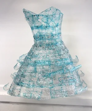
Diala Estela
“Marry Me,” a collection of 6 dresses total divided into 2 sub collection categories, Spring/Summer and Fall/Winter. The bottles were collected from Seymour Johnson Air Force Base, Airman and Family Readiness Center (FRC). AFRC is an outreach facilities providing many types of services and programs that assists those affiliated with the military. The bottles were cut and shrunk by heat, tinted by permanent marker and riveted in a shingling type technique. The plastic shingles were shaped in three different ways: manually, riveting and heating.
These plastic dresses are a representation of military spouses. Majority of spouses are women. Immediately I had the vision of floating see through dresses as the theme, a theme I was able to encompass the depth of a spouse’s journey. A seasonal dress collection is capturing the lighter aspects of a military spouse, a life style of ceremonies, functions, and events. The transparency of the material and the rivets is to create an appearance of both delicacy and strength. The transparency of the dresses symbolizes the vulnerability of the “spouses,” questioning self-identity, purpose and self-worth. The rivets are the menders, identifying and reminding the important key role of a military spouse. The plastic shingles are the bottles collected from AFRC that once belonged to a spouse, a child, a member, a family, a therapist, social worker etc. who’s stories are both beautiful and dark, happy and sad. The overlapping of the shingles is a representation of a support system, each one supporting one another. The floating appearance represents self-sustainability and resiliency. The dresses are to give the viewers the curiosity to want more from the dresses. Perhaps an identity they can place within the dress, behind the dress or on themselves.
As an Art Therapist and Artist my goal was to challenge the areas of psychology and design. I found something intriguing in these bottles. In a meeting at AFRC, I saw the beauty in it all. I realized the bottles carried a story from the lips who drank them. This had inspired me to move forward with the ideas of building a sculpture out of plastic bottles. It became more than an idea. I challenged myself with the material by making trash into fine art and turning design into complicated layers of psychology and discovery.
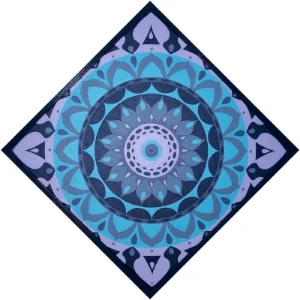
John Orrand
Mandala Manifesto
You could say that I am obsessed with patterns. My mind gravitates toward geometric configurations and repeating shapes. They de-focus my visual understanding and transport my thoughts. Looking into the concentric shapes of a mandala, or other kaleidoscopic art forms, generates a trance-like state which allows me to tune in to my true self.
In turn, the work I make functions as a catalyst for the viewer's own meditative experience. The Mandala Manifesto series invites the viewer's eye to lose focus long enough to look back on itself and tap into something beyond the arrangement in front of them.
These works consist of hand rendered designs using drafting tools, acrylic paint, and patience on canvas. By hanging each mandala on its corner, the orientation provides more dynamic and encourages the eye to read the patterns as expanding outward. I finish each with a handmade frame stained with a paint color from the pallet. A background in art and design, a proclivity for ritual, and a fascination with cosmic patterns and metaphysical concepts have influenced the art I create and how I make it.
For me, art is a meditative practice, and one that is constantly bringing me closer to understanding who I am.
Where will my work take you?
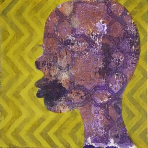
Lakeshia Reid
I am a Durham-based artist whose surface design-influenced work is distinguished by multiple layers of texture, color and pattern. I draw inspiration from my surroundings, particularly the people and the ways they express their identity.
I combine craft, design, printmaking, and painting techniques in the hopes of creating work that focuses less on the outward appearance of things and more on their inner significance. Each piece is an exploration where emotion transcends the substrate and the viewer is asked to rethink what they see.

Tim Saguinsin
I watch my boys hone their motor skills using scissors to cut paper shapes. Then they glue and tape it down to create their own masterpieces--pure love of creation. Using paper, glue and tape, I have returned to that love. I chop and bond animation, design, illustration, painting and sculpture to create work that pulls from my heritage, experience and pop culture.
Piecing together moments in time that overlap to evoke thoughts, feelings, and nostalgia, my vision pops off the wall with a visual language full of animated hues, crafty textures and quirky graphics. Color and textures extrude dimension, volume and dynamic imagery.
Exchange Gallery: May Featured Artists
May 6 - 26, 2016
Exchange Gallery
Featured artists: William Breazeale // James Hallenbeck // Ann Howe // Mary Storms

May 2016 Featured Artists
May 6th-26th, 2016
Opening Reception: May 6th, 6-10pm

William Breazeale
I am a representational landscape painter. I have lived and worked in the Raleigh/Durham area for over forty years, and have witnessed a remarkable transformation of the rural landscape into a complex urban environment. This rapid rate of change in our surroundings offers subject matter for my work: the sometimes jarring juxtaposition of the old with the new; the perception of the transitory replacing the permanent; and the contrast between the basic and the complicated.
The result is that my work often incorporates a panorama illustrating the scale, complexity, and vast expanse of our urbanizing surroundings -- one that contrasts with the partial and incremental view we encounter in our everyday lives. At times I use exaggerated perspectives (from close to the ground or an aerial view) to emphasize the abstract relationships of urban forms and open spaces. In other cases, the constituent parts of mundane objects/scenes can be reorganized to create a new version of commonly experienced places, such as parking deck or airport baggage claim area.
Since I have spent most of my adult life here I have developed associations with locations in the region that have meaning to me. As such my work tends to be of specific, recognizable sites.
I am currently working on a series of Downtown Durham cityscapes that explore the relationship between the past and the present. The downtown historic district, containing wonderful examples of art nouveau and classical revival styles, provides rich subject matter, especially for rendering of architectural details. The redevelopment south of the railroad tracks provides a contrast - in both scale and form - to the original Central Business District.

Jim Hallenbeck
My art has largely been of landscapes, cityscapes, and, at times, the people captured in these scenes. My approach in painting is to represent each subject realistically, while at the same time to accentuate its bright colors. I find my approach to painting to be one of deep introspection complete with a wide range of emotions - inner peace, happiness, honesty, and truth. In turn, I hope to communicate something to the viewer, to trigger an emotion, to spark a memory that resonates on a very unique personal level.

Ann Howe
Growing up in rural Virginia I spent much of my free time outdoors and learned to know and love the natural world and to develop some sense of the mystery that resides there; this has stayed with me throughout my life and informs my work. Art has the power to make us see even the most familiar things in a new light; in the works shown here I aimed for scenes as they appear in memory or the imagination, leaving the viewer free to find his or her own meaning or emotional response.
In all of my work I try to respond to the different possibilities offered by the several media that I use. The fluidity of the hot wax used in this work gives it more freedom and spontaneity than my work in other media and this, in turn, makes me see things in a new light.
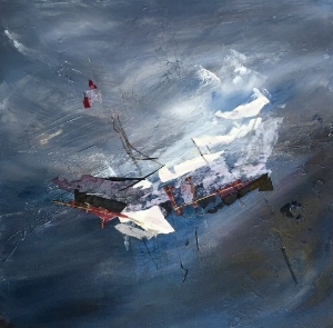
Mary Storms
I express my artistic vision through abstract mixed-media landscapes. I am intrigued and inspired by the natural environment. My intent is to provide the viewer with a sense of the symbiotic relationship between the primeval elements - stone, soil, water and sky - and the lifeforms these elements nurture.
I love experimenting with color, be it bold and vibrant or quiet and subdued. No matter what palette I use, my mixed media canvases and many of my acrylic-only canvases are usually textured. For mixed media, I layer torn or cut handmade paper and/or recycled magazine paper with acrylic paint, sculpting paste and an occasional found object. To add additional depth and texture, portions of some layers are literally scrubbed off with water before the paint, glue or sculpting paste has completely set. Some of these scrubbed portions are left “raw”, while others are repainted and/or papered over. For my acrylic-only canvases, I apply thick layers of paint with brushes, palette knives and my hands.
Exchange Gallery: April Featured Artists
April 1 - 28, 2016
Exchange Gallery
Brenda Brokke // Eric Ennis // Elizabeth Laul Healey // Brian Imfeld // DJ Joynes

April Exchange Gallery Featured Artists
opening reception: April 1st, 6-10pm

Brenda Brokke
I am fascinated with the idea of stacking images in my work. I layer one image on another just as meaning and understanding is often revealed in layers. I follow the contemporary practice of mixing mediums. Collage and printmaking often enrich the layers. As subject matter, I remain intrigued with figurative pieces that address contemporary issues. Much of my work is about the role of females in our society and others, especially China.
My work has been described as a mosaic of images. It uses mixed media, memories, and messages. They are meant to provoke thought.
When I am expressing ideas about females, I often use textiles as well as domestic and decorative patterns.
My work is also a conscious reaction to the prevailing trend of the non-aesthetic or anti aesthetic that permeates much of contemporary art. I make no apologies for being decorative in my work.

Eric Ennis
As an art form, hand beading goes back for centuries to the cultures of Asia, Egypt, India, Russia, Native Americans and the Victorian era–to name just a few–when the art of hand beading was most prominent. Eric Ennis, a bead artist in Raleigh, North Carolina, brings this art form back to life again by painting with beads. After a long career as an ornate dress designer, he has established a reputation as a beading artist. Each bead is sewn by hand, one bead at a time, forming unique pieces of art. Only crystal and glass beads, never plastic, are used on the selected fabric.
His work has drawn in customers from around the world as well as attention from Our State Magazine, The Tar Heel Traveler, WRAL Television Station, and a full page article in the News and Observer.

Elizabeth Laul Healey
I paint with bright vibrant colors about topics that are often considered dark, or perhaps even too taboo to talk about. I paint portraits of women surrounded by complex emotions & subject matter such as human rights, women's rights, race, equality, politics & mental illness. I also create work about how the art world & pop culture world affects us all, even those who think they are adverse to their power. My work is often iconic and easily recognizable by my unique style of outlining my subjects both literally and figuratively. The best way for me to bring up atopic that is important to me such as race or equality without offending people is for them to decipher my work on their own so they can be the judge of what they think is moral or not. I want my work to be provocative and I'd rather someone have a viseral reaction to my work and at least remember it, than to confuse it with some other great artist they are indifferent to.

Brian Imfeld
Can we successfully analyze everything in our world? Will we know something completely if we record and measure every quality? Or are there important characteristics that are beyond measurement? To understand how the world works, we try to measure everything. Is it even possible to know what data should be collected when trying to define something that is as abstract as a thought or a feeling or an individual?
Compositionally my work is inspired by the visual language of graphs, charts and writing. When I plan and lay out my work, I incorporate grids, consider margins, and arrange elements in rows or columns to represent the structure we impose on the world as we try to measure and understand it. I replace the words, numbers, and data of the structure with shapes and patterns to redirect the focus away from the data but toward the way data is presented. The materials I choose and the textures I create, represent those unclear characteristics that cannot be defined or quantified. They spread over the entire surface revealing the presence of these non quantifiables everywhere.
Because in today’s world everything and everyone is subject to this probing examination, it is possible that qualities that connect with you are visible throughout these compositions. Are you an odd shape rising from the surface as texture, or are you the measurements from which other elements can grow? Do you stand on the grid where the data predicts you should be or do you contradict that assumption?

DJ Joynes
I, DJ, artist and operator of ArtZjewels, design one of a kind wearable art that reflects individual personality. My pieces contain elements of color, style, beauty and adventure which are solidly constructed of mostly buttons.
Allow me to describe one. This piece was designed for a little girl named Lily. Lily loves boots, hats, flowers, cupcakes and ice cream and her necklace bouquet contains all these elements. She is also affectionately called “Lily Bug” by her family so of course there are lady bug buttons. The title of this necklace is “It’s My Party, Cowboy!”. This necklace tells the story of how Lily puts on her cowgirl boots and hat, takes Teddy by the hand and off to the rodeo they go. Then tomorrow Teddy will go on his on adventure with his lady bug friends; maybe even have a cupcake party!
Another piece with a cameo, vintage buttons and splashes of color scattered about, might lead the viewer on a garden stroll with a Victorian lady in a sweeping sun dress. Talk is quiet, laughter soft, as they meander about though the shafts of warm sunshine peeping between the canopies above.
Each design is a statement piece and fun to wear. As an accessory, they make any outfit POP!