
ALTARES DEL DÍA DE MUERTOS at Centro
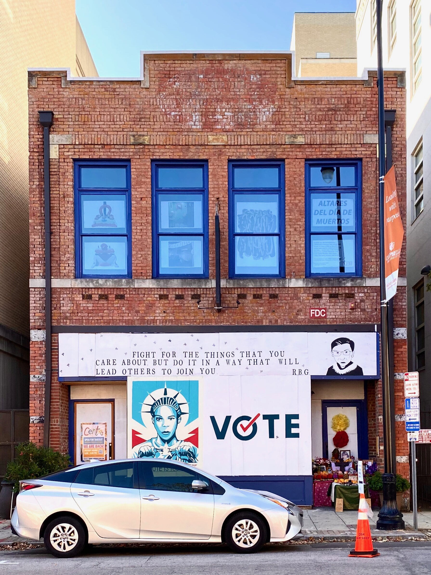
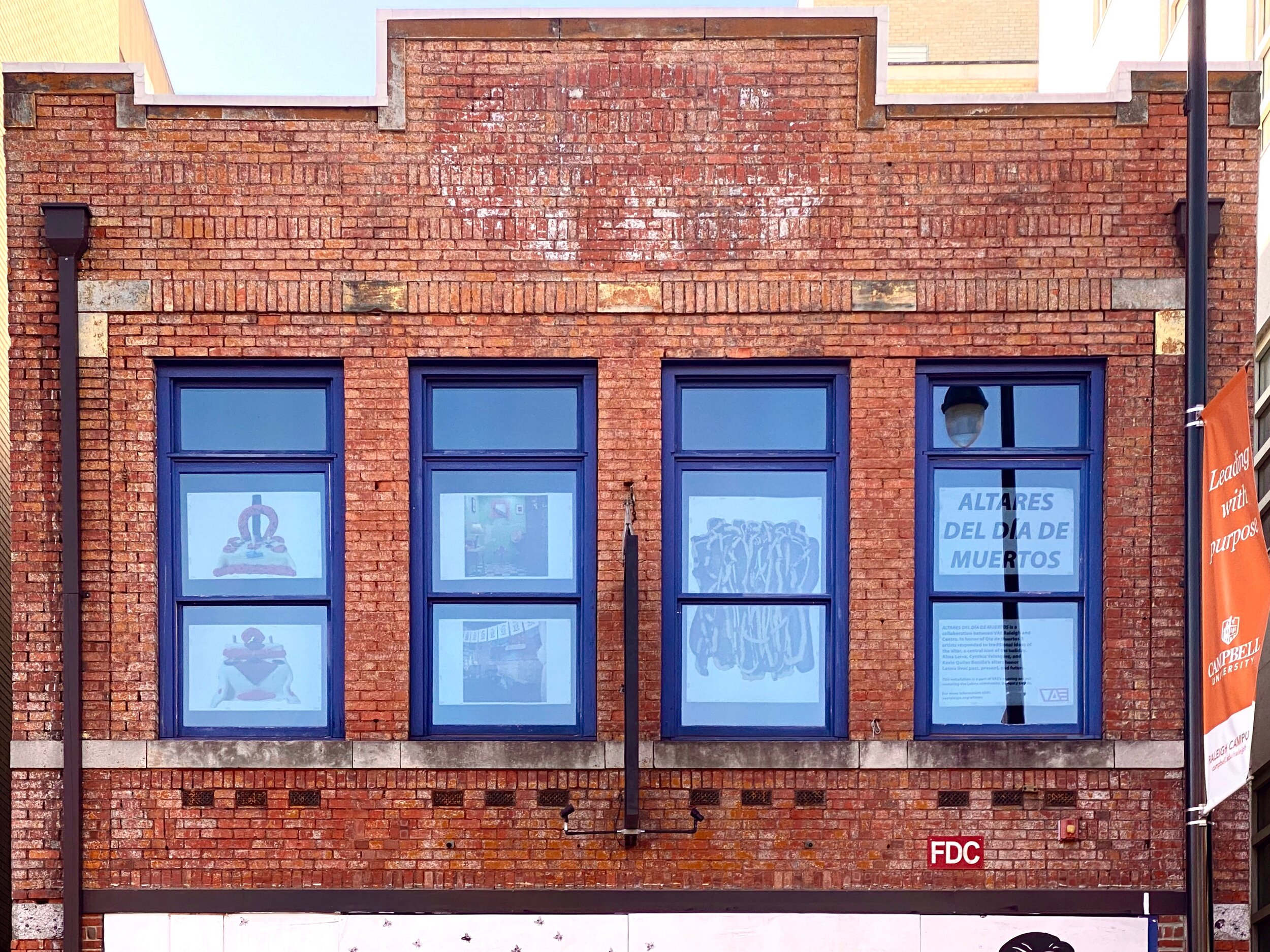
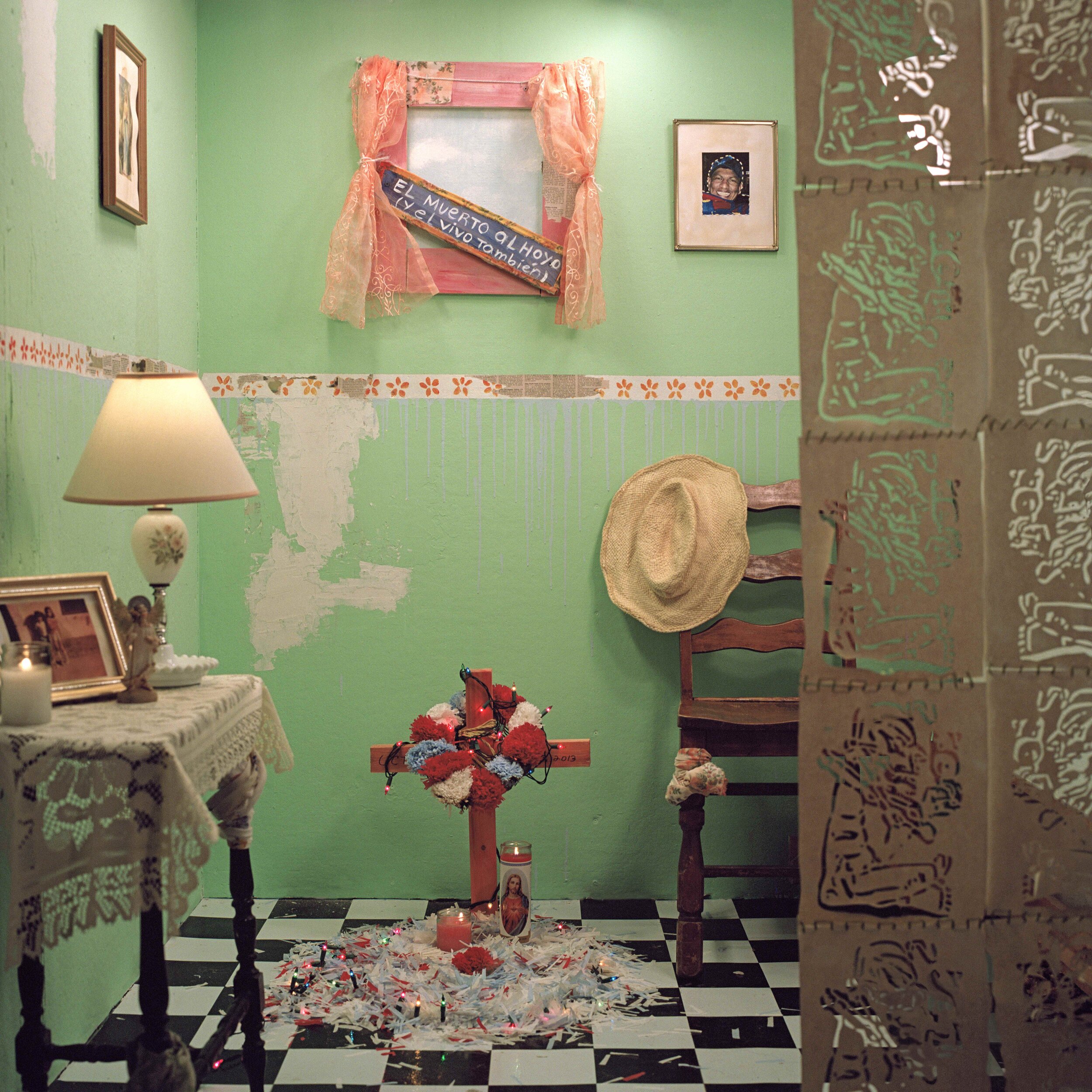
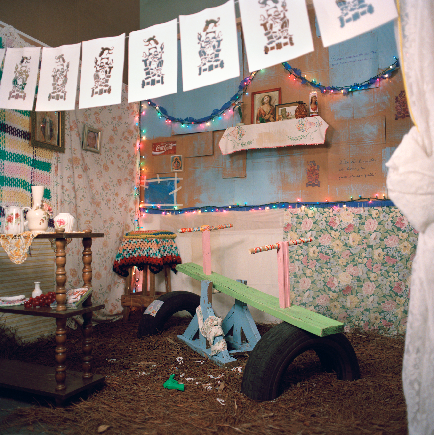
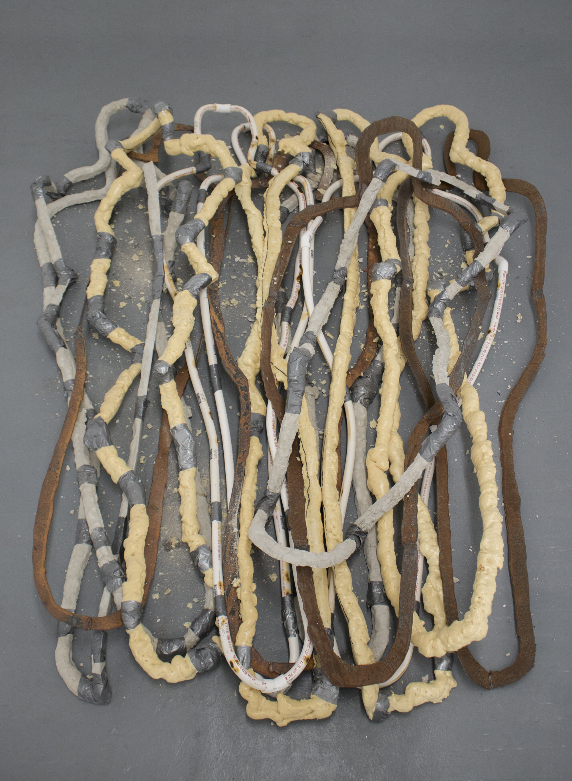
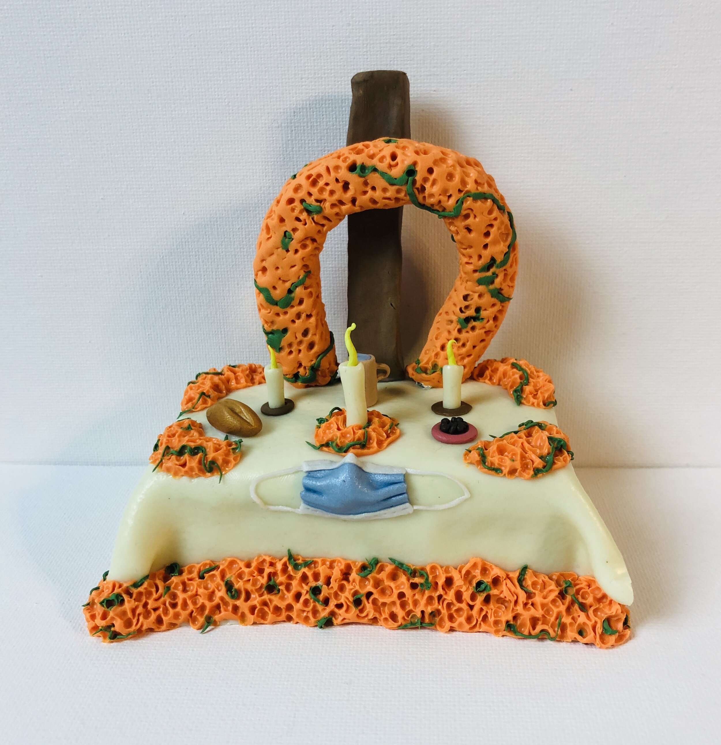
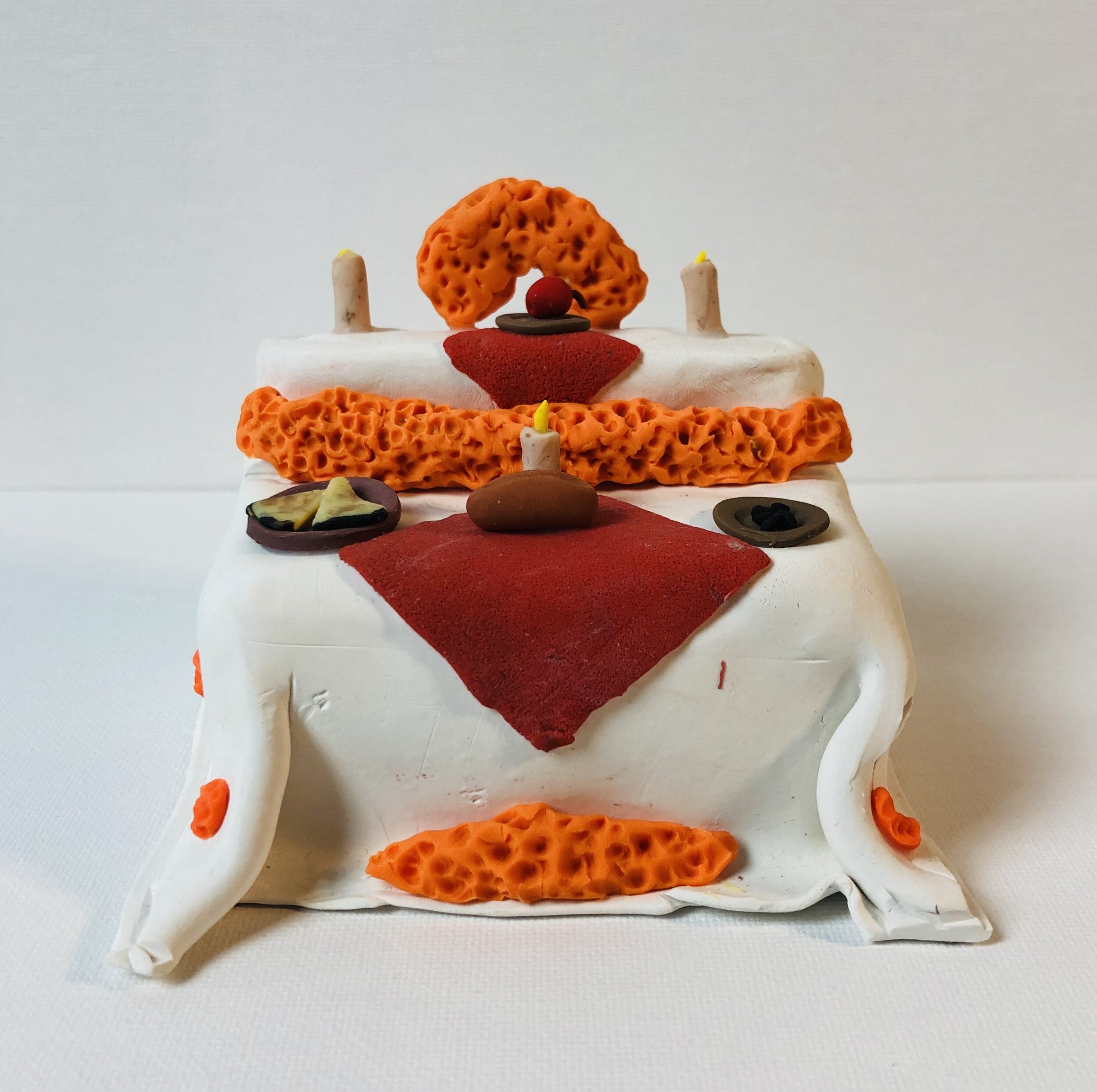
ALTARES DEL DíA DE MUERTOS is a collaborative installation between VAE Raleigh and Centro. In honor of Día de Muertos 3 artists responded to traditional ideas of the altar, a central icon of the holiday which is celebrated from November 1-2. Alma Leiva, Cynthia Velasquez, and Kevin Quiles Bonilla’s altars honor Latinx lives past, present, and future.
This window installation is a part of VAE’s ongoing project centering the Latinx community, De Aqui y De Alla.
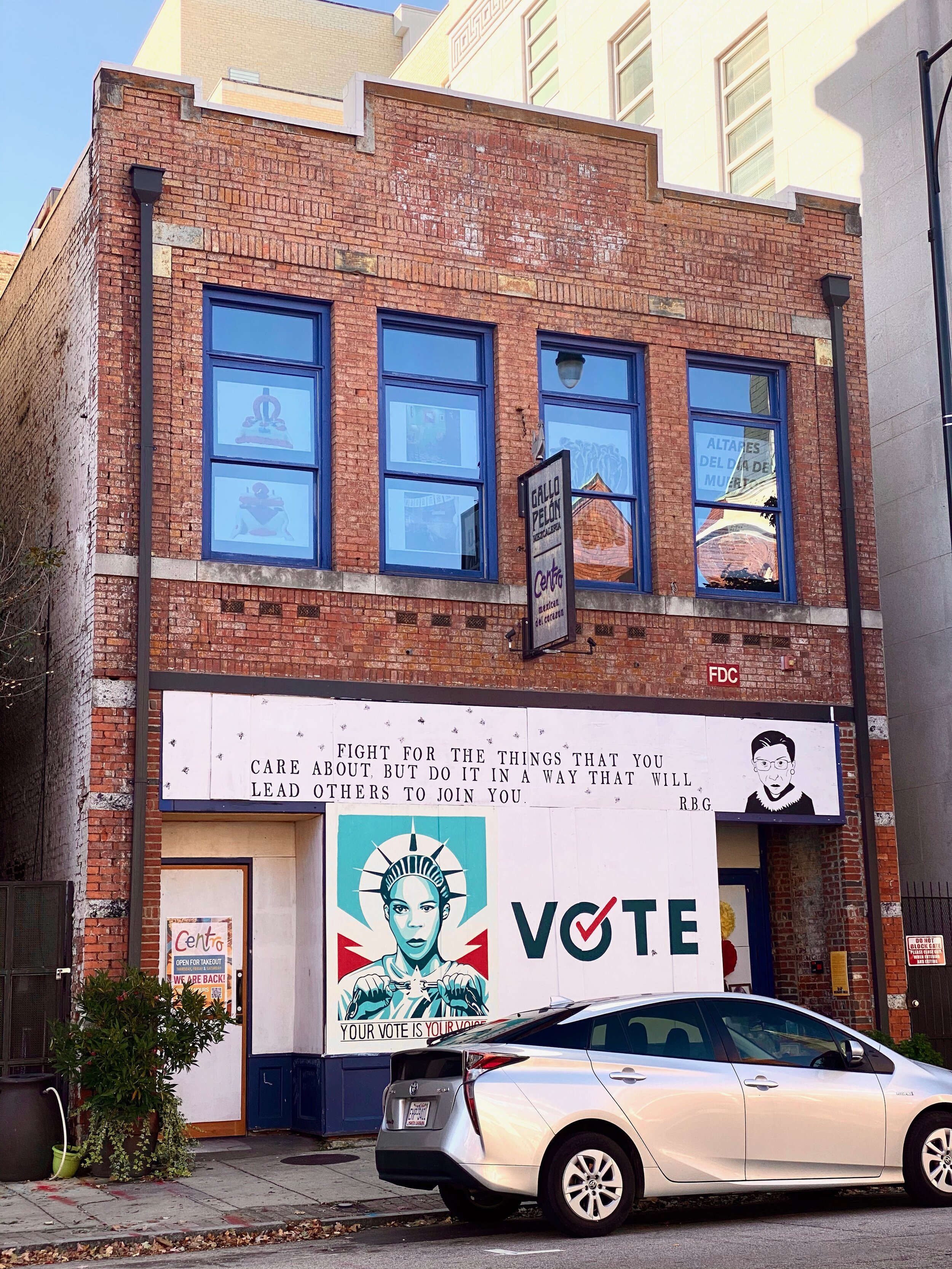
Jade Wilson at Red Hat

We Keep Us Safe - Jade Wilson
Red Hat
100 E Davie St
Raleigh, NC 27601
August 14 - December, 2020
About the artist
Jade Wilson is a Black trans documentary photographer and video artist based in the Raleigh-Durham area. Jade examines the self in relation to others and reveals the identity of an individual and a community. For Jade, their technique is to illuminate the relationship between identity and representation.
About the work
A collection of images, titled We Keep Us Safe, contends with the gap between authentic Black and Brown identity and how it is often misrepresented and appropriated in culture and media. Kids and superheroes, both signs of hope and imagination, provide a way into untangling and understanding this discrepancy.
We Keep Us Safe allows Black and Brown kids to see themselves represented through their own imagination—when the world around them often leaves them out or portrays them negatively. Representation, from media to the tech industry, allows kids and adults to see their future selves as leaders in any space they dream of.
About Open Gallery
The Open Gallery features a rotating series of exhibits for associates, visitors, and the local community. Installations are chosen for their relevance to openness, collaboration, and community—all hallmarks our open source roots.
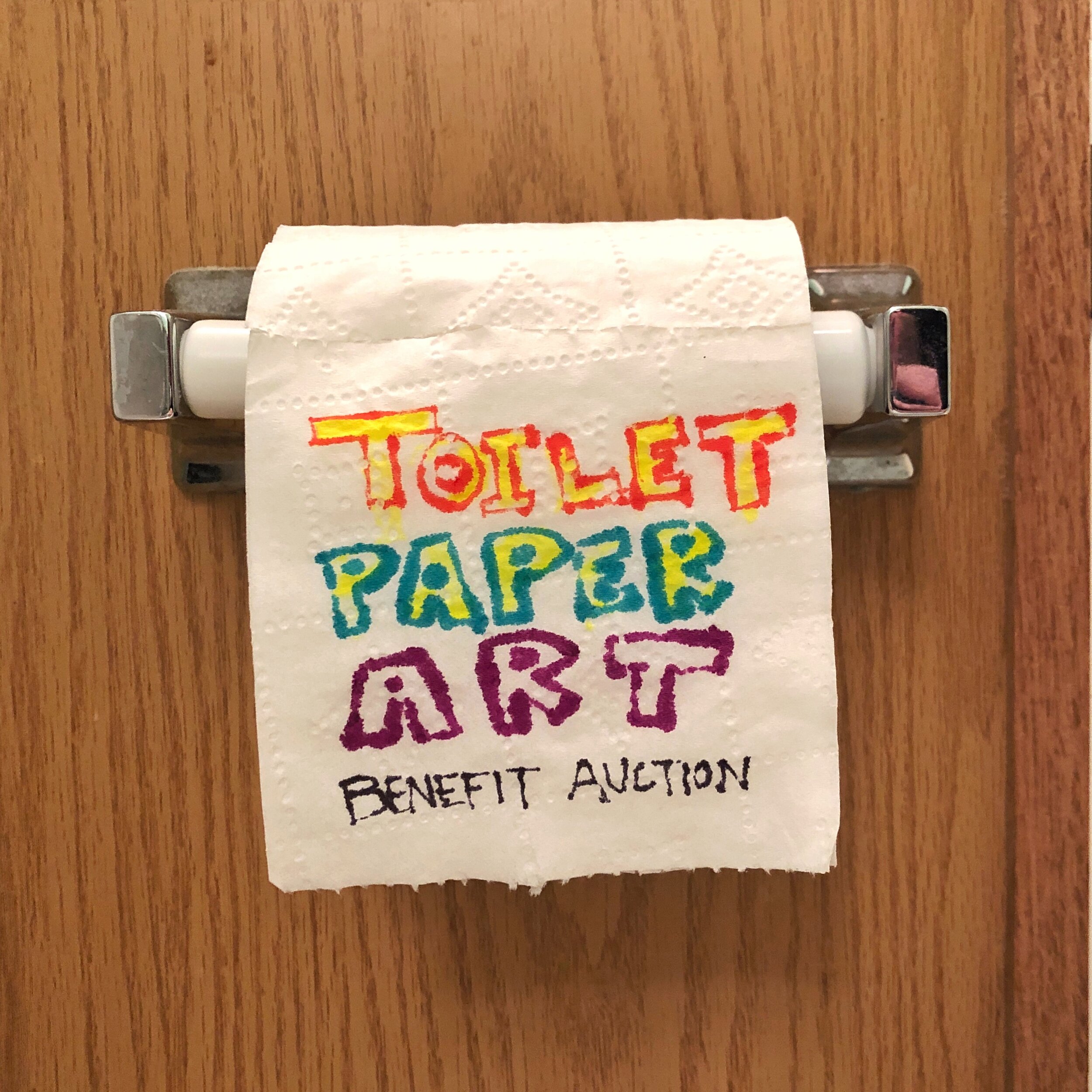
Toilet Paper Art Benefit Auction : Call to Doodie
Toilet Paper Art Benefit Auction : Call to Doodie
Do you need a creative outlet as you have distanced your social interactions? We’re you able to find toilet paper? VAE is the launching the Toilet Pape Art Benefit Auction. We are asking artists to do their duty and create original art, drawings, sketches….doodie doodles if you will…… on an end off the ol’ bog roll and send them in.

Toilet Paper Art Benefit Auction: Call to Doodie
Auction closes at 7PM on April 7. Bid on the art.
Proceeds benefit the NC Artist Relief Fund.
For the past three weeks, 94 artists have come to heed the call to doodie during theses social distance times. In an attempt to foster creativity and bring about some levity, VAE asked artists to create original works of art on a square of toilet tissue– also know as doodie doodles–and donate them for auction. The response has been nothing to sneeze at and we are flushed with amazing works on TP. Bidding on these amazing doodie doodles is open until 7 PM on April 7th.
Proceeds from the auction will go to benefit the NC Artist Relief Fund which has been created to support creative individuals who have been financially impacted by the outbreak of COVID-19.
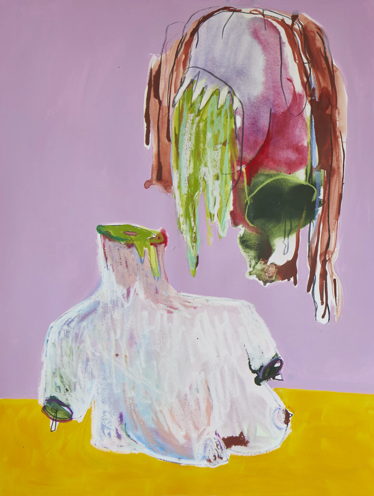
Christine Garvey
Daughters and Saints - Christine Garvey

Daughters and Saints - Christine Garvey
Daughters and Saints is a solo exhibition by interdisciplinary artist, Christine Garvey. Inspired by famous Renaissance paintings - Caravaggio’s Medusa, Parmigianino’s Madonna with the Long Neck, Artemisia Gentileschi’s Judith and Holofernes - Garvey’s colorful drawings re-interpret idealized images of femininity, beauty, and motherhood as inherited from classical painting. As a collection, Daughters and Saints presents a darker, more comical side to these ideals: bleeding breasts, misshapen wombs, self-severing heads, and the angry mouths of children. Through her work, the female body becomes something other than a vessel (The Madonna), a weapon (Judith) or a conquest (Medusa). Garvey presents the female body as powerful and imperfect, but more importantly, as having agency in its own pleasure, pain, and evolution.
Christine Garvey is based in Austin, TX.
On Friday, April 17, I [Ant] virtually sat down with artist Christine Garvey to talk about her Cube exhibition, Daughters and Saints, her process, and her inspirations. We started off by talking about the impact of COVID-19 on Raleigh, Austin TX (where she resides), and on the arts. Christine gave me a tour of her home studio and shared more about the influences behind her exhibition, which had only been open for one week before VAE had to indefinitely shut its doors to the public in the face of the pandemic. Throughout the interview, Christine and I explored and broke down the design of her exhibition, its feminist themes, and how concepts of ruin are addressed through her graphic, yet aesthetically captivating, mixed media drawings.
Interview accompanied by images courtesy of Christine Garvey
Christine So I forgot about all my work.
[shared laughter]
I was like, what is that show about? I forgot. I haven't seen the drawings in a while so I was like looking through the images like, oh yeah, that's what's there.
Ant Yeah, I had to read the gallery guide because I was like, at this point, everything was kind of happening so fast that now it's like, all right, next thing…You just opened your show, it had only been open for one week when we closed, whereas the artists that were in the show in the main gallery, they had been there since January. So for them, we were like, okay, if you need your work back, we'll ship it back to you now. We'll figure it out. But we were supposed to open a new show like a week ago? The first week in April, whenever that was.
C Yeah. So what are you guys gonna do about that? How is that working?
A We just pushed it back. We e-mailed all the artists pretty immediately after we closed and were like, hey sorry. This is the deal, this is what's happening, here is our plan. We're still moving forward with all of the exhibitions that we had planned for the year, maybe with just some minor tweaks or maybe combining a couple of concepts.
C Oh, yeah, no, it's wild times. I'm also part of a nonprofit gallery space here [Austin, TX] and we're trying to curate for the following year. We're like, how do we do this? It's kind of impossible to anticipate things.
A Yeah, it is. It definitely is. It's the anticipation part is pretty difficult. That's what we've been working around at VAE. But luckily, all of the ideas we had for exhibitions for later in the year were loose concepts and didn't have much meat to them yet. It's been really nice for Kyle and I to kind of be able to divide and conquer and do more research and be a little bit more prepared for things when we reopen. What were you working on for that space? What do you do there?
C It's called Mass Gallery, it's in Austin. It is members like...It's an artist collective! It's an artist collective gallery. I think there are like fifteen of us and we have a gallery space in town and we curate shows and we do like public programming and events and things. So before I was a member there, I had a show there and that's how I found out about them. It's a really great space. They bring artists from all over. And Austin has a similar scene to what I have gotten a vibe that Raleigh has, where it's like tight-knit community. It's a smaller city and there are not as many spaces as like New York or Chicago or something, but the spaces are really invested in putting quality stuff out.
A So what was happening there, and in Austin, right before everything shut down?
C We were curating a show. Oh, we had SXSW. SXSW was supposed to be happening.
A Oh yeah, yeah, yeah!
C Yeah! So all of that shut the city down and that had a huge effect on the economy of the city because a lot of money is brought in by SXSW. Now we're just improvising with the time we have. I think they're just going to push some of our exhibitions back and I think some of it's going to just be online.
A Yeah, I completely forgot that SXSW was supposed to be happening literally like right as all of this started. That was kind of one of the first big things, I feel like, to be shut down.
C True. I think we were all shocked, but it made sense because if they did not cancel it it would have brought so much potential spread of the virus to the city so it was a huge public health risk. So yeah…I thought an interview would be fun to do, especially with your background with curating and it sounds like you do so many different things, so I thought it would be kind of fun to talk about the show.

Installation shot of Christine Garvey’s exhibit Daughters and Saints
A I definitely am interested in your process…So I want to talk about the wall colors that you chose to paint the Cube (lavender and light green). I see some samples behind you. Are you in your own studio?
C I am! I feel very lucky to have my workspace in my house, that's been nice. Yes, it was my color testing for the show, which now I need to paint over. And it is funny to see this, the purple, because it does look like a big penis, weirdly.
A [laughs]
C I'm Skyping people and I'm like, I need to paint over that…
So I would say that I'm an image-maker, you know that is more how I might define myself. I was making sculptures last year and then kind of hit this wall where the feelings that I wanted to create and the installations that I wanted to create, which had a lot to do with the body and seeing the body as this thing that could come apart and put itself back together, how to experience the sense of ruin and the cause of pleasure in ruin, and I thought that feeling of ruin was going to be best experienced through materials. So I started making objects. I started using hair and using tar and spray paint and all of these really tactile things. That was a hugely generative work and time period for me.
This past Fall I had a lot of stuff going on and all I really wanted to do was to sit, and I wanted to draw, and I wanted to draw in one place, and I wanted to copy classic images or paintings that I had always really been drawn to. I have a long history with Italy, I studied abroad in Florence and studied Renaissance art. I did a Fulbright there in 2015 where I was looking at and studying Renaissance painting and working at these technology museums. And so I have collected all of these books of Renaissance painting and I just wanted to kind of like, sit with them. I wanted to observe how motherhood was being presented in these books, thinking about motherhood and like the expectations of motherhood and kind of that pathway of being a mother and what that might look like.
All I did in this process when I really needed to kind of get my footing and ground myself, was to copy these images. So I would sit and I would look at, you know, these Madonnas and Child and I would copy them, or I'd start to look at more grotesque images like Judith and Holofernes, which is really violent, and I would copy it. Or I would look at Parmigianino's Madonna With the Long Neck and I would copy it. And there is something, you know, in my creative process where through copying, I'm able to really internalize content and then make it my own and reinterpret it in a different way. It's really kind of fundamental process of how I learn.
So that was like the place of where the drawings came from. I often use color in a really funny way, kind of similarly to when you see these Renaissance images of Judith and Holofernes, or the Medusa…They’re images that are, when you look at them, they're really compelling because they're so well-made and you're like, wow, I just want to continue to look at that. It's so captivating, but the image itself is really troubling. The subject matter is really troubling or the violence of it is really troubling. And so as an artist I'm super compelled by that push and pull of the wanting to engage with something and in that process of being drawn in by something that might be really, you know, enticing, you're confronted with something that's also really problematic. I love the poles of that and the way that I engage with that is through color. When I make a work my color palette is really lively. It's really kind of sugary or fun, but oftentimes what I'm rendering is something that is troubling in some way. Because the color has a language of its own, it really undercuts that trouble in a way that I find really interesting. So a lot of times people will look at my work and they'll be like, “I would be so freaked out by this if it wasn't for the color. I would feel troubled by this if it wasn't for the color.” And that to me is really interesting because you don't exactly know where to place yourself. There's an element of joy and celebration in this topic of ruin, you know, or self severing or destruction, which is oftentimes what I am depicting, you know?
A Obviously, the colors of the gallery, I think, are very much so informed by the colors in the works themselves. The arch shapes that you chose to paint on the walls, they call upon Gothic architecture and architecture from the Renaissance and what we see in paintings from that time, too. So, would you say that the color scheme for the gallery walls was first informed by the colors in your paintings and then the shapes of the arches on the wall came from the more historical context of the works you were looking at?
C Yeah, and I wanted to create a temple of some kind. I think that kind of came from the images. The name of the show is Daughters and Saints, so it's like taking a look at these characters who I think are oftentimes flattened. When we think of Madonna and Child we don't think of it with any sense of specificity. It's like an archetype. So I'm taking that kind of archetype and presenting a more nuanced representation of it, whether that is making the Madonna seem kind of ghostly, or monstrous in some way, but also really ethereal and beautiful in her own right while also presenting kind of a tense relationship between the child and the mother. I took all of these images and I recreated them and I wanted to create a temple that could hold them in some way. So, when you walk into the space it doesn't have that anonymous feeling of like, a white gallery space where you distance yourself from the work. You are invited into an environment that feels in the spirit of the images themselves and the colors that are being used. It was really hard to choose colors in some ways because, if you think about it, you know, the arches, we get this feeling of it being a temple or a church or a place that has some type of pattern affiliated with it. But if I picked blue or if I picked red or if I picked any of these things, the associations we have with those colors can are really strong and that might pull us in one way or another. So I wanted to pick colors that synthesize the work and the range of the colors in the work, but also felt like you didn't have a direct connection to the Renaissance, like a navy blue or a pink. [Lavender and light green] are kind of unusual colors that you wouldn't see in a cathedral, right? So it has that kind of blend of cathedral and carnival, which is where my work kind of situates in a funny way. So that's how I thought about it. It also is the quantity of the color. So you'll see I had to paint the archway, or a version of it in my studio, to really understand what's going to be the impact of that color when it's painted in a space. How does that color feel in space? I was really happy with how it came out.
A Yeah, I really love the two colors you chose. They work beautifully together. I've seen that gallery painted a lot of different colors and I think that the two you painted are probably the best colors that I've seen in there. I think that gallery wall paint colors are a huge debate when it comes to the art world and a lot of people feel very strongly about the whole idea of the white cube.
C What do you think about that?
A I...I don't know. I kind of, I feel like I stand the no-man's-land because I've seen some shows, like yours, that are painted beautifully, but then I've seen some shows where the walls should have just been white. I saw this show not too long ago and they had painted the walls pink. It was the softest shade of like, baby girl pink you could imagine. But it just looked gray. When you put the gallery lights on it it just washed it out completely and turned to gray. Wasn't a great application. At the same museum there was a different exhibition on postwar art from Japan, which was a cool perspective because, you know, we spend so much time seeing American art from the postwar period, that’s what I study so I'm a little bit partial to it, but the show, they had dark gray walls and then all the pedestals had like these modernist steely objects on them. So everything was just like one shade of gray. It was a very fittingly modernist color palette, you know, but very hard to see the piece and take it in. That's the whole reason we love the white wall, it doesn't distract from the content and we can kind of view it objectively. Yeah. You know, I don't think there's anything wrong with one side or the other.
C It's risky! I had a show where I had a wall that was pink and the first shade of pink I painted I was like [screams]! That does not work! You freak out a little bit because what you imagine in your studio is always going to be different than the space. You're definitely taking a chance.
A Yes, definitely. And I think people expect to see white, you know? Whether they realize the historical context of the white gallery or not, it doesn't matter. But I think it's one of the things that people don't realize is there until it's changed, you know? Until they see a wall in a museum that isn't white, they're like, “oh, wait, that's an option! Wow. Why don't we see more of that,” you know? And I think that a lot of art that is in Renaissance galleries and museums, you know, we get those dark like reds and greens, which I love. Those colors are so passion filled to me, but when it comes to the contemporary art world, I think it can kind of go either way. And I think the strength of the work can help or hinder those decisions as well. So like in your case, where the colors are in the works themselves, I can say, oh, this green is right here in this drawing. I think that's a nice little connection. I like that because I like things to go together and, you know, for things to be cohesive! And your show is!
C And too, I still am like, was that green the right choice? I still think about it. But I think the whole point of having a show is that it's informative. To go back to what you were saying, I'm like, where to go next? Any time you put work out there the goal, or at least for me, is to get more information about it, about what it can do. So if I picked colors that I'd already worked with before, for me, that wouldn't have been the most useful. These felt like really risky colors, but I have much more information now to move forward and to kind of push myself to the next thing…And too, [the gallery at VAE] is an unusual space because it is a cube. So like you're moving around it, but that circulation is not really why. You're kind of spinning in place. The archways were another way to create that sense of movement, and to give you a sense of height. It really draws your eye up to look higher.
A Definitely! I mean, after all, it is called the Cube. Before, I know you talked about your study with materials and 3D and sculpture. Had you ever dealt with subject matter like this before in those media? Looking at Renaissance paintings, I mean. I know that you studied abroad and that is a huge part of this, obviously, but did the classic paintings ever come through in your work before in a different way?
C Not specifically. I think I've always been influenced by Renaissance painting and I've admired it, but in terms of directly referencing it, no. I think a lot of the themes in my work have dealt with ruin, and ruin is such a celebrated thing in Italy, like the celebration of history and destruction and living in that side-by-side in our current world. Kind of like basking in the possibility of ruin. I have always appreciated that about Italian culture and I have seen that theme kind of rise up in my work. This was a way for me to really not just directly digest these images that I admired, but to think specifically about these feminist themes that I wanted to touch upon. In my work before I was specifically working with self-portraiture and I started to copy and model my own body and my own image and I would take that thing apart and reanimate it. A lot of times when I do that in my process, it's kind of to come to terms with the idea that our bodies will inevitably fail us, and that is just a central piece of humanity that we all have to deal with, especially in these moments. When I deal with uncertainty the thing that I always try to think about, specifically with this pandemic especially, the thing that I always try to come back to is the truth that I know. I think when I reference the body and what it can do and what it can't do, and specifically the female body and how it's been represented as an instrument of other people. For example, Caravaggio's Medusa, and the legacy of Medusa and how her head was cut off and used as a weapon to destroying things. Or Judith and Holofernes, Judith was used as a weapon, an instrument of destruction. In all of these Madonnas and Child where the female body is like a vessel for somebody else to use... I think in drawing all of these images, I could claim that body back and I could make and have a sense of agency in its own destruction and its own pleasure and its own power. So, a lot of the times in my work, the body is being torn apart, but that severing seems like it's coming from within. Self severing versus something that is being forced or instrumented by a male force or an external force. Does that make sense?
A Yeah, that makes perfect sense. That was very beautifully put. The part when you were talking about the Madonna with Child, and you said "the female body is a vessel for somebody else to use," that made me feel a certain way…
C Yeah. I mean, what I think one of the things that I might start researching next is, I love the work of Artemisia Gentileschi. She's like one of the few female painters that came forward from [the Renaissance].
A Oh, she’s great!
C She presents a more complex representation of motherhood because she herself was a very reluctant mother. And her story is really troubling…She was the daughter of a painter, so she had a lot of like access to learning how to paint in the community. And then she was raped by her tutor and then put on trial and tortured when she was on trial, and then married off in order to legitimize and make it okay that she was raped. And then she was a very reluctant mother, at a young age. She has a really hard story. So, she has these images of motherhood where it's a mother breastfeeding and her breasts are bleeding and she's so disconnected from her child. And I think, where does that story fit into this? How can I bring some dimensionality to that story? Where does the violence, where does the disconnection, and where do the kind of troubling aspects of early motherhood, where does it sit in all of this? I'm looking for that in some way through the body and through how I draw or recreate these images.
A Yeah, absolutely. So…
[long pause]
A ...I just need to sit with that. That was a lot...
C Right now I’m looking at an image of Parmigianino's Madonna With the Long Neck. I love this image so much because that baby is so huge! But also everything is so elongated. So there's a sense of something else that I'm tapping into in a different way, the exaggeration of the body and the long hands, and the long childhood body, it was a way that [the artists] could show their mastery, their understanding of the body and making it work in a composition. But it's also so grotesque, that exaggeration, and I'm really compelled by that. I tried to tap into that in the piece where I recreate it with the really long fingers, the kind of monstrous baby, the disfigured breasts, and the sloppy head coming off of the neck. Yeah, I like to exaggerate that piece of it.
A Yeah, absolutely, and I think that's like you were saying, that it was all about mastery of the body and kind of retapping into those classical ideas. Then you get a painting like Parmigianino's, where we can really appreciate it and we love it and we see it, but you know, it's that little tweaked kind of sense of perfection that I think gets overlooked a lot. I definitely see that in your work, for sure. So, outside of these classical paintings and all of the Renaissance art that you've studied, what other artists do you look at as inspiration, in your work, and just in your life in general?
C Oh, man. I mean, it really changes from week to week.
[shared laughter]
C I've always loved Francis Bacon. He's like an early favorite.
A Oh, yeah.
C I think that he was the first artist I ever really loved. His use of color...and those with space and the body. I've always loved that. I love Kiki Smith as I move more into making images and then making objects. Kiki Smith's practice is so great because wherever the idea belongs she finds the right format, whether it's a sculpture or print. She is so free in where she lets the ideas live and I'm trying to learn how to do that more in my work.
I love David Altmejd. He is a Canadian sculptor based in New York and Montreal, I think. I just like the tactile quality, his use of color, his use of humor, and his pulling the body apart. He makes the body feel like silly putty in a way that's so funny, but troubling.
I love David Shrigley, his sense of humor and that he is not afraid of being silly and dark at the same time. I like people who can swing between, they don't see these things as different states. They see the darkness as enhancing the silliness and with silliness as enhancing the darkness. Art that I don't know exactly how to feel in front of, and that I can feel different every time I look at it, is the most compelling stuff. Art, that doesn't take itself overly seriously, too. I think that is the stuff that I feel most engaged with right now. I think we're in a culture where we take things way too seriously, I don't know if that's even what I want to say, but like it's like we're in this culture of "wokeness" that's just hard as a viewer sometimes to know where to sit and how to engage in a way where you're challenging yourself, but at the same time, being authentic to yourself.
A Yeah, yeah, yeah. I think it's easier to engage when you see those kind of polarities broken down, and I think it makes it easier to sit with the work and be with it. It's you know, it's less, I don't want to use the word aggressive. It's easier to approach, like you said.
C That's where I'm at right now. It's not to say that I don't want to be challenged, but there is a looseness in all of those artists’ work that I find very forgiving.
A That's a great point. Absolutely. Um, so...oh, I just found a typo in the gallery guide. I just caught it out of the corner of my eye.
[shared laughter]
A So you said the idea of the title, Daughters and Saints, comes directly from these paintings. Does that have any other sort of significance to you, or were there any meanings that the works kind of revealed to you while you were making them? Like, things you didn't expect to happen or things you didn't expect to kind of think about?
C Things that the work revealed that I wasn't expecting?
A Yeah.
C Yeah. I mean, like all the time.
A Yeah, I know that was kind of a loaded question.
C Yeah. No, it's a good question. I guess the way the show comes together for me is like you just follow a hunch…you follow a hunch and you do it with a sense of persistence enough and patience that you generate enough content that what is surprising reveals itself. And you get to know yourself better because you sit in front of this work and you're like, okay wow, I just copied all of these Renaissance paintings and their violence, but they're colorful and they are pulling the female body apart and they have kind of a disconnected relationship with other figures in the frame. Like what's happening there? When you've been making art for a long time, you're able to draw everything that has surfaced in connection with a longer thread of themes that have come up in your work again and again.
I think at this point for me and my work, what is interesting is where the drawing and the sculptures fit together, but also these more feminist themes that are emerging in my work. And also my relationship to religion…I was raised Catholic, but I never have thought about that as a part of my art practice or as having any significance there. I think as I kind of dig deeper into hierarchy and the things we revere, and patriarchal systems, and Italian culture, and depicting sainthood, and depicting motherhood, and depicting all these things, I think I'm starting to find where religion fits in all of this. I'm also thinking about how and what I want to subvert about those structures and how I want to separate them. Maybe a piece of that is with this temple that came about is having it be like, what is this as a place? What do we do in a place like this? What do we worship? What do we pay attention to? What is elevated and what is diminished and how? As an artist, I can control that and kind of draw connection to a holy space, and maybe subvert the conventions of that holy space through an installation. So that's a piece of it that's come up.
The title of the show itself, Daughters and Saints, is, I guess I like the word daughter because it implies that you are in relation to somebody else, you are somebody's daughter. You're not your own person, there's a sense of obligation or expectation, or “belongingness," in the word daughter that I feel in these images and looking at them as being like, they are women that are of other people. And then Saints, I guess I see that word as something that's more autonomous, or your power comes from within. I like that kind of the push/pull between those two words. It is what makes them different. You know, one is human and one is other worldly. And how do they coexist?
A No, I definitely have the same attraction to the title of that show for that reason. Yeah, that was another good answer. I'm glad that you touched a little bit on your relationship to religion because that was another thing that I was going to ask about. Your exhibition definitely has a very heavy Catholic feeling.
C Does it? Okay, interesting.
A Yeah. Well, I think so. I mean, I definitely identify more with the pieces that look at the Greek examples. I mean, obviously, all the paintings are Renaissance Italian paintings, but I love the ancient classical allusion, that's one thing I look at a lot in my own work. I spent a long time studying Hellenistic art and Greek sculpture, and spent a lot of time doing alt process photo work where I was kind of tuning into those personalities of heroes and legends in similar kind of ways in which you're mining in your own territory. So I am always interested in how we kind of latch on to these historical figures, whether they were real or not, and kind of self-identify with them a little bit.
C Yeah, totally! It's like an archetype that you get to reinterpret and every artist has their interpretation of that archetype, and I think that's so cool. So it's nice, it's kind of interesting to like participate in that through copying.
A Yeah, absolutely. Absolutely. So once the show closes and the walls are back to white where do you see the work developing after this?
C Yeah. Well you know, right now is a funny moment because I have been thinking a lot about, or at least I try to think a lot about, how what I'm making can be in service to where I'm at. It's a lot about feeling sane and grounded, and like dealing with the repetition of every day, it's kind of all like blending into the next day...
A Amen!
C One big mushy day. One of the ways that I have been dealing with that is through self-portraiture. I've been sitting and just drawing myself. There's something really cathartic about that repetition. I imagine that what might start to happen is that I might start embodying some of these themes through self portraiture. I don't want to speak too soon. Again, like I said earlier, all really successful creative periods for me are when I have a hunch, and I just persist on that hunch and then see what happens. So, right now I'm doing a lot of self-portraiture. I imagine that will blend in with some of the stuff I'm looking at, and then hopefully I will make some drawings that are big. We'll see what happens. And then, if I ever install them, they'll be in some type of installation format. So I like to mix it up so it's not just like a white cube.
A That sounds great! I look forward to seeing how the work develops. I love the installation aspect to all of your work, it’s definitely well thought out and executed.
C Awesome! Thank you so much. It's been so fun to chat with you!
A Absolutely! It’s been great. Thanks Christine, I hope that you have a good day!
C Thanks, Ant! Have a good day! See you later. Bye!


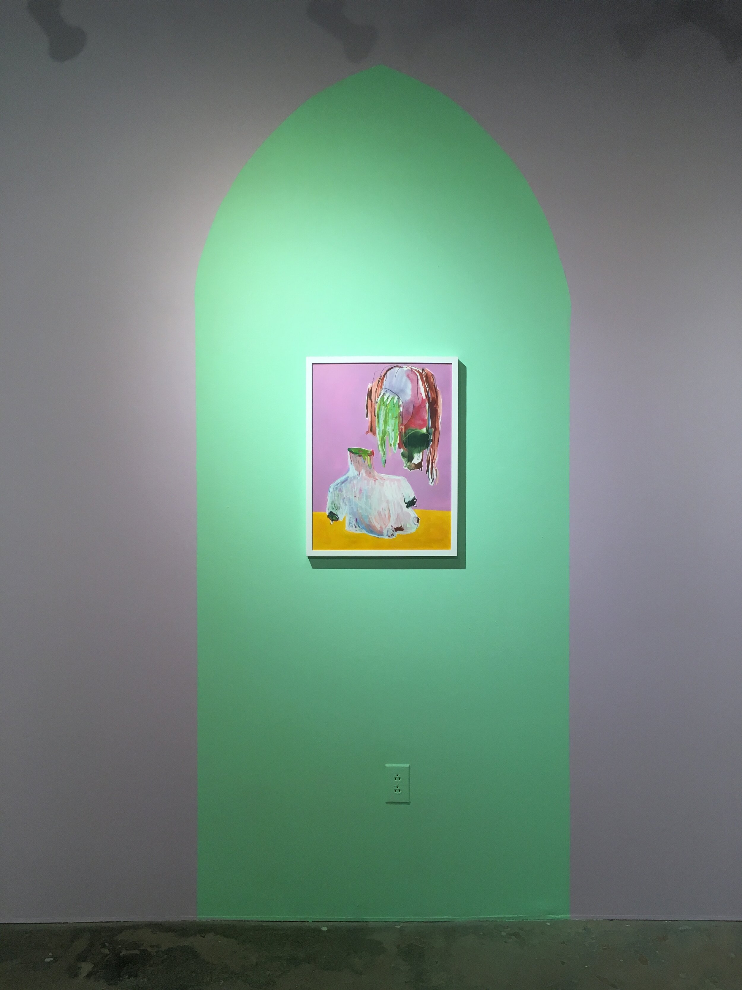


Descalza

United Arts Council
410 Glenwood Avenue
Raleigh, NC 27603
January 22 - February 29 , 2020
Born in El Salvador and raised in North Carolina, Lisbeth Carolina Arias has woven her story as an immigrant of the United States into a clothing brand that is cherished by those who are proud of their heritage.
As a young girl growing up in rural NC, fashion design served as the first outlet that didn't have a language barrier. It was one she and her mother, a highly-skilled seamstress, could finally cross together. Arias studied Fashion and Textile Design at North Carolina State University, interned in community-focused brands in Guatemala, Brazil, Mexico, and Italy, and worked for several fashion studios, including Vera Wang, in New York City all before starting Descalza.
Descalza, meaning barefoot in Spanish, empowers communities through handwoven fabrics and reminds us of where we come from and who is still at home. As a handcrafted, made-to-measure, fashion label, Descalza bridges both communities by collaborating with artisans from Latino America to weave the fabrics and local seamstresses in North Carolina to create the statement pieces. Together, they create unique and colorful statement pieces that make us proud of our immigrant beginnings and to be de aquí y de allá.
Carolina’s exhibition at the United Arts Council is a part of VAE’s upcoming project, DE AQUI Y DE ALLA (of here and there). De Aqui y De Alla is a contemporary art project with the goal of exploring the duality that our Latinx community members feel. This feeling comes from living in the United States but not being white enough to be accepted without discrimination while being seen as to gringo to be fully accepted in the culture they identify with. The project will feature the work of Latinx artists who use their unique identity to combat this lack of acceptance and carve out space for themselves both here, and there.
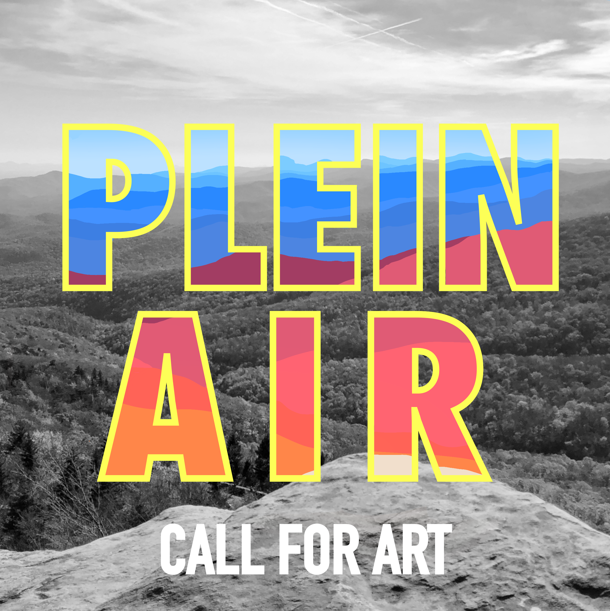
Plein Air Call for Art
Deadline to enter: TBD
Exhibit run: TBD
Location:REX Heart and Vascular
2800 Blue Ridge Rd
Raleigh, NC 27607
This exhibition is being placed on hold along with the rest of VAE’s exhibition schedule due to the outbreak of COVID-19. Updates will be made as soon as we are able to congregate and view are together safely.
Raleigh, NC 27607
Calling all Plein air painters! The world is filled with captivating urban and landscapes, people, and culture. We are calling on you to submit your awesome paintings to be exhibited at REX hospital’s North Carolina Heart & Vascular Center.

Deadline to enter: TBD
Exhibit run: TBD
Location: REX Heart and Vascular
2800 Blue Ridge Rd
Raleigh, NC 27607
This exhibition is being placed on hold along with the rest of VAE’s exhibition schedule due to the outbreak of COVID-19. Updates will be made as soon as we are able to congregate and view are together safely.
Calling all Plein air painters! The world is filled with captivating urban and landscapes, people, and culture. We are calling on you to submit your awesome paintings to be exhibited at REX hospital’s North Carolina Heart & Vascular Center.
VAE works with Rex Heart and Vascular to exhibit and collect artwork by local and living artists in order to provide a positive environment for their patients and their families. The hospital features rotating exhibitions of artwork created by artists who believe that art can have a positive effect on people.
Details- Entries must be received by 11:59 pm on April 13, 2020
- Entries must fit through VAE’s 104″ x 71″ door to be exhibited.
- Juried with JPEGs.
- Two entries per artist.
- Entries must be able to hang with a wire
- Entries can not be over 30 lbs
- VAE reserves the right to wire/re-wire work to best hang with the hospital’s system.
Entry Fees
members………………..…$10 per artwork/$20 for two pieces*
non-members………..……$15 per artwork/$30 for two pieces*
*All entry fees are non-refundable.
Entry Information:
All files should be named like so: 01_LASTNAME_TITLE.jpg, 02_LASTNAME_TITLE.jpg.
Still images should be sent as jpegs should be at least 1000px at their widest dimension, not to exceed 2MB per image. 2D artists may submit one JPEG per entry. 3D artists may submit two JPEGS (one full shot and one detail) per entry. Follow the filename format for works as indicated above.
Video samples should be edited to no longer than 2-minute excerpts. It is strongly preferred that video & audio artists submit their work online through clips or url addresses to online sharing formats like hulu, vimeo, youtube, or dropbox. Videos submitted as uploaded files should be submitted as Quicktime files whose width is no larger than 720px and file size is no larger than 10MB (as that is the largest file eligible for upload on our entry software). Please only submit video art or video documentation of an art piece that requires video to be fully experienced. Do not send video walk-throughs of static exhibitions or video slideshows. While web-hosted submissions are strongly preferred, video and audio samples can be submitted on CD if necessary. Please contact Kyle Hazard to make arrangements for CD delivery prior to deadline. Follow the filename format for works as indicated above.
Audio: Audio should be submitted as separate MP3 files. Each track should be no longer than 2 minutes. Follow the filename format for works as indicated above.
Web-based: Web-based work should be submitted as a URL listed in the work sample list. Please only submit web-based projects. A portfolio website that features audio/video art and still images will not be considered.
Eligibility
Plein Air call for art is open to any living artist. A maximum of 2 works of art, per artist may be submitted. Two-dimensional entries will be accepted. Work must be original and completed in the last 2 years. No copies, mechanical reproductions, molds or kit work will be accepted. Visual Art Exchange reserves the right to exclude work due to size or special requirements. Entries must be hand-delivered to the gallery or mailed in a returnable container.
We will not exhibit or financially support work that co-opts the story of a community without representation from that community acting in a decision making role.
Accessibility
VAE’s gallery space is fully accessible and we strive to make the submission process accessible as well. We encourage anyone to enter our open call exhibitions. If you need any additional information or accommodations in order to enter this exhibition please email Ant or call 919.828.7834.
Shipping Artwork
Ship artwork using a sturdy, reusable packing materials clearly labeled with your name and telephone number. Do not include return postage in case the artwork sells during the run of the exhibition. Following the exhibition, each artist who shipped their work should generate a FedEx label and email it to our Director of Exhibitions so the piece may be returned. Do not use styrofoam packing peanuts.
Ship To:
Visual Art Exchange
c/o Ant Lobo
309 W Martin Street
Raleigh, NC 27601
Sales
Visual Art Exchange will retain a commission of 25% for VAE members, 35% for non-members on all work sold during the exhibit. If a work is not for sale please indicate with NFS value in appropriate space during registration or on the consignment sheet. Click here to join VAE!
Liability
All entries will be handled with the utmost care and respect. VAE is not liable for artwork during transportation to or from the gallery but does carry a blanket inland marine policy that covers most fine artworks and craft items up to $5,000. VAE reserves the right to refuse coverage to artwork with inherent vices, high values or that is deemed unstable. By entering into this show, the artist agrees to abide by all rules and regulations as set by exhibition guidelines.
Documenting Activism

National Humanities Center
7 TW Alexander Dr,
Research Triangle, NC 27709
January 15 - March 28 , 2020
Protests and social activism have shaped the United States since before its birth. The right to assemble and the right to freedom of speech are protected by law specifically because of their ability to check authority. Art, in its broadest sense, has always played a vital role in the push for social change. One of the most important roles art has played is to document acts of protest and activism so that those moments live on and become part of our collective history.
About the Venue: The National Humanities Center is a nonprofit institute for the study of all areas of humanities. This fall, NHC will welcome its incoming class of learning fellows from 30 states and four countries.

Juror: Caitlin Penna
Caitlin Penna is the University Photographer at Western Carolina University, a freelance Photojournalist, and a freelance Photographer based in Sylva, North Carolina. Her ultimate passion is telling other's stories through photography and writing. Caitlin tends to be drawn to conflict, social justice, religion, and your everyday folk.
With this being said, Caitlin hopes to inspire her viewers in the brightest and darkest moments that unfold in front of her lens.
FEATURED ARTISTS
Philip Cherry IV
Ben Hamburger
Martha Leonard
Corneille Little
Cailin Penna
Jody Servon
Nicole Drake @ Frontier

Frontier
800 Park Offices Dr
Research Triangle, NC 27709
December - March
ARTIST STATEMENT
Nicole is using this body of art to explore their own expression in abstract paintings Nicole Drake is a Raleigh based artist. Originally from coastal Georgia, Nicole studied and received their BFA in Studio Art in the North Georgia Mountains. From there, they chose to move to Raleigh with their horde of pets for new art opportunities. This body of art is Nicole’s first exploration into abstract paintings. Nicole uses negative space to encourage movement and intrigue for viewers. Contrasting values and colors create depth and engagement. Every abstract painting is named after an influential woman in Nicole’s life. Without these encouraging people, Nicole’s experience and growth in Raleigh would not be what it has been or will continue to be. This exhibition honors them.
Bob Rankin @ Rex Heart and Vascular

Rex Heart and Vascular
2800 Blue Ridge Rd
Raleigh, NC 27607
September - March
ARTIST BIO
Bob Rankin is a life long resident of Raleigh and an eighth generation North Carolinian. He graduated from the E.C.U school of Art and has studied extensively throughout Europe. His adventurous travels have taken him to over 40 countries. These experiences have greatly influenced his artwork. Bob's passion for teaching led him to a 30 year career in Wake county public schools. He was Sanderson High Schools teacher of the year, as well as, North Carolina Art Education Association's Secondary Art Educator of the year. Bob has exhibited nationally and internationally and is in over 30 corporate collections.
Duane Abbott - Novozymes

Novozymes
September - February
ARTISTS STATEMENT
Duane Abbott delights in iteration and combination, color, meaning, and joy. He is obsessive in his pursuit of theme and variation and compulsive in his desire to create images and objects that inspire happiness and optimism. He has steadfastly pursued his point of view and expertise while always creating art that is immediately accessible and compelling. He hopes that his love and fascination with the world and living are evident and contagious. Any meaning comes from the moments he has spent creating art and the life he has lived to that point. He is human. And each day, if he forgets to remember his reason for wonder (that he is alive and able reflect on that fact) when he wakes, he remembers while he is taking photographs or working to enhance them. All he wants is for a few other human beings to see this. While enjoying traditional photography, Duane also works to create photos that are more like paintings. He combines images to accentuate meaning, provide two-dimensional texture, and most of all, deliver joy. His goal is to continually improve his skill and expand his subject matter. To this end, even while traveling in pursuit of recreation, he has always pursued his art. Wherever he is in the world, he strives to document the place (city, town, or field) and its denizens (people, animals, insects) to provide the elevation that that place and its inhabitants deserve. He wasn’t born to be a traveler or a photographer, but he continues to live up to those monikers in the best ways that he can.
Morgan Benshoff @ SEPI

SEPI
1 Glenwood Ave Suite 600
Raleigh, NC 27603
SEPI is a private office, if you are interested in seeing Morgan’s work please email Kyle.
December 2019 - May 202
ABOUT THE ARTIST
Morgan Benshoff is a native of Greensboro, NC. She graduated from Appalachian State University in 2015 with a BFA in Painting and Drawing. She currently resides in Greensboro where she works and keeps a studio at 205 Collaborative.
”The foundation of my art practice is curiosity. The meaning of my paintings will change over time and with circumstance, but I continue to be fascinated by the alchemy of paint and water. Somehow, paintings become more than the sum of their parts, and this pulls me back to the paper or canvas again and again. My work can be understood as a record of a tactile experience, pulling the viewer close with a meditative surface, which slowly reveals a poetic silliness. I like to think of the paintings as abstract, imminent objects rather than allusions. They allow perception to shift around and through them, striking a balance between formal composition and intuitive touch. They exalt softness. They are sly, somehow. Perhaps most importantly, they are affirming in their beauty, creating a relationship of reciprocal freedom with the viewer.”
VAE'S 40th Anniversary Gala Artwork Donations
By donating artwork to VAE’s 40th Anniversary Gala you enable us to continue hosting 60+ exhibits, producing 40+ educational programs, and providing more than $100,000 directly to artists each year.


By donating artwork to VAE’s 40th Anniversary Gala you enable us to continue hosting 60+ exhibits, producing 40+ educational programs, and providing more than $100,000 directly to artists each year.
VAE has spent the past 40 years working to make the Triangle a more creative place where artists can launch and sustain creative careers. We cannot do this work without your help! Over the past year, with the help of the artists, authors, performers, and creatives that make up our community, we were able to build a 700-square foot arthouse in the middle of our main gallery, host 30+ solo exhibitions, and fill an abandoned Kmart with the work of artists of color, and provide a creative avenue for scientists to showcase their work in our main gallery.
DONATION DETAILS
Please fill out the artwork donation form (see below).
If you make your artwork donation before February 10th, VAE will include it in an artwork preview sent out to all ticket holders and sponsors.
VAE will happily accept any artwork donations up until February 24th.
NEW FOR 2020: Artists receive a 40% commission on all artwork sold at the gala.
All artwork can be dropped off at VAE’s offices at 309 W. Martin Street, Raleigh NC 27601 or schedule a pick-up with Kyle Hazard by emailing kyle@visualartexchange.org or calling 919.828.7834, please leave a voicemail if we are not able to answer.
All donating artists are eligible to purchase two “Donating Artist Tickets” for $65 each (an $85 discount from general admission).

In order to make our annual art auction more equitable and directly beneficial to artists, we are giving all artists the opportunity to receive 40% of the purchase price of their work!
99% of artwork in our past 10 auctions have been successfully purchased. VAE’s 2020 auction will put an estimated $20,000 directly into the pockets of artists who donate work.
Secondhand Salon - D.J. Neon


Danielle James
January 2 - February 8, 2020
Each mass-produced item in this show was salvaged from the secondhand store or the trash and given a neon facelift. Using the imagery already inside of the painting and through pop culture references, these material mashups bring new creative life into these discarded objects. Danielle’s work provides a commentary on contemporary American consumer and social culture that invites viewers to examine their own habits.
Danielle’s exhibition in the Cube also acts as a two pronged reminder to the artist and consumer alike:
1. So many artists (who are alive and work today) could use your support much more than Hobby Lobby.
2. Mass production of objects and our cultures consumption is most certainly contributing to our global climate crisis.
Danielle is a Durham N.C. based neon bender, artist and metalsmith whose works have been exhibited internationally. She is a member of the all-women neon art exhibition SHE BENDS and is currently a 3rd-year neon apprentice under neon artist and sculptor Nate Sheaffer at Glas neon in Raleigh N.C.
The Cube is sponsored by Celito.net who make it possible for us to pay all exhibiting artists a stipend for sharing their creativity with our community.Celito.net
